Hi, i’m
Mahanthi
I’m a product designer with 6 years of experience turning complex ideas into digital experiences that feel simple, intuitive, and a little delightful.
I love figuring out how things work, obsessing over the little details, and making things better than I found them. For me, good design isn’t just about looking pretty. It’s about making someone’s day a little easier.
When I’m not pushing pixels, I’m probably running somewhere  , planning my next trip ✈️, or experimenting in the kitchen 🍳. Basically, I like keeping things moving, on and off the screen.
© {{ year }} Bitti Mahanthi Keshav
Sometimes, work starts with a friendship.
When I first moved to Delhi to work at Outlook, I was trying to make friends outside work. I bought a cycle and joined a cycling club. What started as a way to meet people eventually introduced me to a whole new circle of friends.
One of them was the founder of Astech Systems Pvt. Ltd.
Through that friendship, I got the opportunity to work on Spark WHS, a product he was building for golf clubs. It was a freelance project that brought me into a domain I knew very little about, with a problem that went beyond designing a few screens.
The idea was to help golf clubs move player records and handicap-related workflows into a digital environment. My job was to take the initial product direction and turn it into a structured, usable experience.
01First, I had to understand the game.
I knew very little about golf when I started. I understood the basics of the sport, but the concept of a handicap was unfamiliar to me.
The client shared an initial UI flow and walked me through the product’s requirements. From there, I began researching how golf works, how scores are calculated, and what a handicap represents.
A handicap accounts for differences in playing ability, helping golfers of different skill levels compete more fairly. Understanding the concept also helped me see why the product needed more than a place to enter scores. Player information, course configurations, tee details, and score records all played a role in the wider workflow.
Before I could make decisions about the interface, I needed to understand the relationships between these pieces of information.
That learning became the foundation for the design.
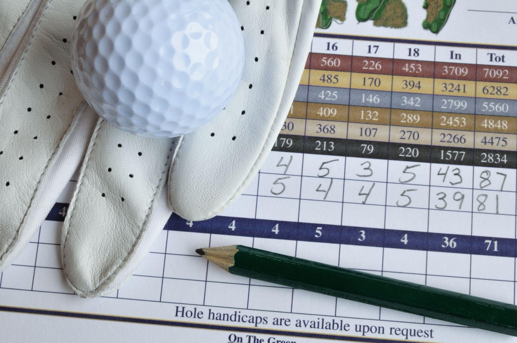 Tees, holes, scores and handicaps: the pieces the product had to connect.
02
Designing around the people managing the game.
Spark WHS was built for golf clubs, with club staff and administrators at the centre of the experience.
Their work involved maintaining player records, managing access, configuring course details, entering scores, and accessing handicap-related information. These were connected responsibilities, and the product needed to bring them together without making everyday administrative tasks unnecessarily complicated.
I worked on the information architecture and user flows to establish how these areas would fit together.
This included player management, course configuration, tee and hole details, score entry, individual handicap records, scorecards, and the broader handicap list. I had to consider how administrators would move between these tasks and how information entered in one part of the system would relate to the others.
The focus was on creating a coherent structure for a specialised product, rather than treating every function as a separate screen.
03From an initial flow to a product experience.
With a clearer understanding of the domain and its workflows, I moved into wireframes and interface design.
I shared the proposed structure with the client, whose understanding of golf and the product requirements helped validate the direction. His feedback was an important part of the process, particularly when checking whether the proposed workflows reflected how the system needed to operate.
My work extended beyond the administrative dashboard. I also designed the marketing landing page, creating a public-facing introduction to the platform alongside the product experience itself.
Together, these pieces helped translate the original idea into a more complete digital product.
A case study without the screenshots.
The client developed the software through his own team after the design phase. However, because Spark WHS is a B2B SaaS product and the client has explicitly asked me not to share screenshots publicly, I can’t show the actual product interface in my portfolio.
That means this case study has to tell the story differently. Rather than presenting confidential screens, I’ve focused on the problem space, the workflows I worked through, and the design decisions involved in structuring the experience.
I also don’t have verified adoption figures or performance metrics to share, so I’ve kept the account focused on the work itself.
What stayed with me.
Spark WHS was a reminder that design opportunities don’t always arrive through a formal job or a carefully planned introduction. Sometimes they come through the people you meet along the way.
Professionally, the project pushed me to get comfortable with an unfamiliar domain before designing for it. Learning the fundamentals of golf handicapping helped me make better sense of the product’s requirements, while the work on information architecture and user flows reinforced how important structure is in administrative software.
What began with a friendship from a cycling club became an opportunity to work end to end on a specialised B2B product, from understanding the problem to designing the experience that the client’s team went on to develop.
Outlook Traveller
Rethinking the digital experience of a travel publication.
End-to-end design2025
Digital strategy, UX, visual design, editorial systems, workflow efficiency
 The redesigned homepage on desktop.
Outlook Traveller had no shortage of stories to tell. The challenge was making them work together online.
From destination guides and food to culture, responsible tourism, and travel inspiration, the publication had built a rich editorial catalogue. Every month, the print magazine brought these stories to life through considered layouts, striking photography, and a distinct editorial identity.
The website told a different story. Content was everywhere, but the hierarchy wasn’t doing it justice. Repeated layouts made different sections feel interchangeable, and the experience didn’t reflect the quality of the publication.
I saw an opportunity to do more than modernise the interface. The website needed to become a better digital extension of the magazine, one that could help readers discover stories, strengthen the brand, and make publishing easier for the editorial team.
The gap between print and digital
The problem wasn’t a lack of content. It was how the content worked together.
Looking at the existing homepage, almost every section followed the same formula: a heading, a familiar tagline, and a row of image cards. Destinations, places to stay, responsible tourism, editorial features, guidebooks, and videos all had a place on the page, but the repeated presentation made it harder to distinguish between them and understand what deserved attention first.
The opportunity was to give every story the space and structure it needed.
That meant creating a clearer content hierarchy and a more coherent brand experience, while accommodating the needs of both readers and the publishing team.
Making the website feel like Outlook Traveller
I didn’t want to copy the print magazine onto a screen. I wanted to bring its editorial character, strong imagery, considered typography, and sense of discovery into a digital experience designed for how people actually browse.
That meant rethinking the existing structure rather than simply applying a new visual style. I focused on improving text contrast, giving photography and headlines more room, and making different content categories recognisable without fragmenting the overall experience.
The goal was a digital publication that felt connected to the magazine while working on its own terms.
The experience also needed to translate to mobile, where discovering a destination or reading a travel story can feel very different from browsing on a desktop.
The business of fitting everything into the header
The navigation had to do more than help people explore Outlook Traveller. It also had to accommodate the wider Outlook publishing network.
That included Outlook Luxe, Outlook Business, Outlook Money, and Respawn, alongside Traveller’s own sections and subscription access. Every link had a reason to exist, but giving everything equal prominence would overwhelm the header.
I approached it as a prioritisation problem: making the wider ecosystem accessible without competing with the experience readers came for.
The challenge wasn’t simply to remove options. It was to work out how several legitimate business needs could coexist without demanding the same attention.
Other Outlook brands tucked behind one dropdown, on tablet and mobile.
White space is doing a job
One of the most interesting design discussions centred on a layout featuring a single article with generous white space around it. The immediate reaction was that the space was being wasted.
Editorial teams naturally want their stories to be seen. There’s always another article to promote, another image to include, or another piece of content that deserves a place on the homepage.
But white space wasn’t wasted space. It was part of the hierarchy.
Giving a story room to breathe changes how it competes for attention. It can make the page feel calmer, help the photography stand out, and give the headline more impact. Showing more content at once doesn’t automatically make a page more useful.
I learned that sometimes the best way to explain a design decision was to show the alternatives side by side, including a deliberately less effective version.
That shifted the conversation away from personal preferences and towards the actual effect of the design. It was a reminder that my role wasn’t just to create a design I believed in, but to make the reasoning behind it understandable to the people working with it.
 The Latest Issue section, given room to breathe.
A better system for the people publishing the stories
Not every problem needed a redesigned interface. Some needed a better workflow.
OT Insider, Outlook Traveller’s user-generated content section, used a distinctive badge on its image thumbnails. Whenever the editorial team needed a new image with the badge, they had to ask me to prepare the asset.
It was a repetitive task that created an unnecessary dependency between editorial and design. I wanted to make the process self-serve without compromising the consistency of the badge.
I created a reusable template in Figma Buzz with the badge preset in place, allowing editors to replace the background image while keeping the badge intact.
Instead of repeatedly solving the same production request, I created a system the team could use independently. It was a small change, but it gave editors more control and removed the need for manual intervention on a recurring task.
Good design doesn’t always mean adding a feature. Sometimes it means removing the need to ask for help.
Designing for the publication, not just the page
The redesign brought together problems that were easy to treat separately but closely connected in practice: the brand, the reader experience, the publishing workflow, and the wider business.
A cleaner homepage alone wouldn’t solve an inefficient publishing workflow. A more attractive navigation wouldn’t fix weak content hierarchy. And a visually rich website wouldn’t be successful if it compromised readability or performance.
The real opportunity was to make these parts work together, creating a more cohesive digital experience for readers and a more considered system for the people behind the publication.
That was the thinking behind the redesign: not simply to make Outlook Traveller look better, but to make the experience of discovering, presenting, and publishing its stories work better as a whole.
Visit Outlook Traveller ↗
OT Eats
A new appetite for discovery.
End-to-end digital designOutlook Traveller Eats2025
Digital experience, editorial design, brand expression, product thinking, business opportunities
Food has always been part of travel.
Sometimes, it’s the reason you visit a place in the first place. A city’s street food, a regional recipe, a restaurant tucked away in an unfamiliar neighbourhood: food is often how we discover a destination beyond its landmarks.
But food discovery doesn’t stop when a trip ends. There’s always a new restaurant to try, a chef to discover, or something worth making at home.
That overlap created an opportunity for Outlook Traveller.
Food was already a natural extension of its editorial universe. Giving it a dedicated platform would allow us to build a more focused food audience, explore new content formats, and create opportunities for partnerships and advertisers across the hospitality and F&B industries.
That became OT Eats.
The challenge was to turn this opportunity into a distinct digital experience, one that could stand on its own while benefiting from the recognition and credibility of Outlook Traveller.
01Familiar enough to trust. Different enough to remember.
OT Eats needed to feel connected to Outlook Traveller, but it couldn’t simply look like another section of the existing website.
The parent brand already had an established identity. We wanted to retain that familiarity while giving the food vertical a personality of its own.
The direction was more playful, colourful, and energetic. Food is inherently visual, and the experience needed to reflect that. Photography could take centre stage, headlines could be bold, and illustrations and small animated details could bring some character to the interface.
The idea was to create a younger, more lively expression of the Outlook Traveller brand without losing the credibility that came with it.
Not a completely separate identity, but a distinct destination within the same ecosystem.
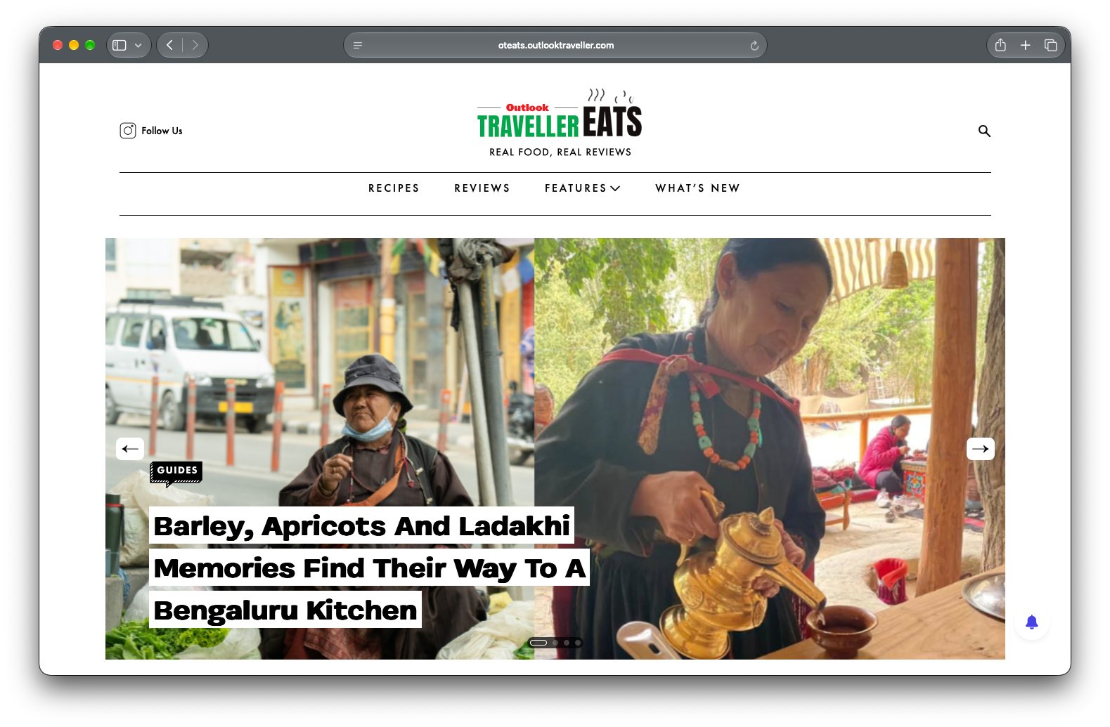 The OT Eats homepage: a brand extension with its own voice.
02
Designed for people who are curious about food.
We weren’t designing exclusively for serious food enthusiasts or restaurant critics.
The audience was anyone who enjoyed discovering something new to eat. That could mean finding a restaurant for the weekend, reading about a chef, exploring a city’s culinary scene, or learning to make a regional dish at home.
That range shaped the content experience.
Restaurant reviews sat alongside recipes, food guides, features, and stories about what was happening in the industry. Each format offered a different reason to visit, but together they made OT Eats a broader destination for food discovery.
The homepage brought these formats together through a clear editorial structure, using a prominent lead story, image-led cards, and dedicated sections for different kinds of content.
The aim was to make the experience feel like a food publication rather than a catalogue of articles. Readers could arrive with a specific question or simply browse until something caught their attention.
Recipes, reviews and chef profiles: one editorial system, different reasons to visit.
03What if OT Eats had its own restaurant-rating system?
The website was one part of the opportunity. I was also thinking about what OT Eats could offer beyond publishing reviews.
I started looking beyond the review itself. Could OT Eats create its own restaurant-rating framework, and could we help readers act on those recommendations without leaving the experience? I pitched two complementary opportunities: a structured rating system that could become a recognizable editorial property, and an EasyDiner integration that could connect restaurant discovery with reservations.
A conventional review tells you what someone thought about a restaurant. But when deciding where to eat, the food is only part of the experience. Service matters. So does the drinks menu, the atmosphere, and the overall feel of the place.
I pitched an idea for a structured restaurant-rating framework that could give OT Eats a more recognizable point of view.
Instead of relying on a single overall score, the concept would evaluate restaurants across four dimensions.
- The Star Dish would highlight the dish worth visiting for.
- Service would reflect the quality of the dining experience.
- Drinks Menu would assess the restaurant’s drinks offering.
- Vibe Check would capture the atmosphere and overall character of the place.
Each dimension would receive its own score, alongside an overall rating. The goal was to help readers understand not just whether a restaurant was highly rated, but what it was actually good at.
I explored how this could appear as a compact rating card, giving readers a quick way to compare different aspects of a restaurant before deciding where to go.
The rating card, with an EasyDiner reservation module alongside.
But I also saw a wider opportunity. A recognizable rating framework could become an editorial property in its own right, giving restaurants a reason to pay attention to OT Eats and potentially opening up new partnership opportunities.
The concept was inspired by the broader idea of established restaurant-rating guides, but with a framework built around the dimensions we wanted to highlight.
It was still a proposed idea, rather than a proven commercial product. Its potential depended on developing a credible rating methodology and ensuring that editorial judgments remained independent of any commercial relationships.
For me, this was an opportunity to think beyond the immediate website: how could the platform create something distinctive for readers while building a proposition with longer-term business potential?
04Extending the brand beyond the website
The editorial experience didn’t stop at the website. Social media offered another way to bring OT Eats’ content to its audience, particularly through visual formats that could make food stories easier to discover and consume.
I designed social media creatives that translated the brand’s visual language into a feed-friendly format. For recipe carousels, the challenge was to turn a complete recipe into a sequence of clear, digestible steps, using food photography, ingredient illustrations, and simple directional cues to guide readers through the process.
The goal was to make the content feel cohesive with the OT Eats brand while adapting it to the way people browse and interact with content on social platforms.
A recipe carousel, step by step, on Instagram.
05Giving food a personality of its own.
The visual direction extended beyond the logo and photography.
I wanted the interface to feel expressive without becoming distracting. Bold headlines and strong imagery established the editorial character, while playful illustrations and small animations added moments of delight.
The donut animation was one example. It brought a little movement and personality into the experience, reinforcing the idea that OT Eats could be more playful than a traditional editorial website.
These details weren’t there simply to decorate the interface. They helped give the new vertical a character that readers could distinguish from the parent publication.
The result was an experience that retained the structure and credibility of an editorial platform while feeling more energetic and food-focused.
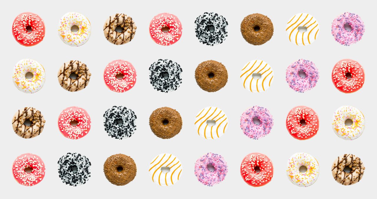 The donut animation.
When the industry starts paying attention.
The launch was well received, particularly within the hospitality and F&B sector.
Quite quickly, we started receiving a steady flow of invitations from hotels, restaurants, and new openings for reviews, tastings, shoots, and other editorial collaborations.
That response was an encouraging early signal. The industry was engaging with OT Eats as a dedicated food platform, rather than simply treating food as an occasional extension of travel coverage.
It also helped build a pipeline of original content and relationships across the hospitality ecosystem.
For a new vertical, this mattered. The opportunity was always about more than publishing more articles. OT Eats needed to establish its own relevance with readers while creating new editorial and commercial possibilities for the wider Outlook Traveller business.
The early response suggested there was a meaningful space for a dedicated food platform within that ecosystem.
More than another website.
OT Eats started with a simple observation: food was already a natural part of the Outlook Traveller experience, but it had the potential to become something much bigger.
My role was to translate that opportunity into a digital experience with its own personality, while thinking about how the platform could support editorial discovery and create opportunities beyond the interface itself.
That meant designing the experience readers would see, establishing a distinct visual character, and exploring ideas like a restaurant-rating framework that could give the venture a recognizable proposition of its own.
The result was a food-focused extension of Outlook Traveller, with a distinct digital identity and early signs of relevance within the hospitality industry.
The project reinforced an important part of how I approach design: the interface is only one layer of a product. Understanding the audience, the brand, the business opportunity, and the systems that support them is just as important as getting the screens right.
Visit OT Eats ↗
Indiespiral
Bringing handcrafted textiles to the digital storefront
E-commerce design · UI/UX · Shopify · Visual storytelling2025
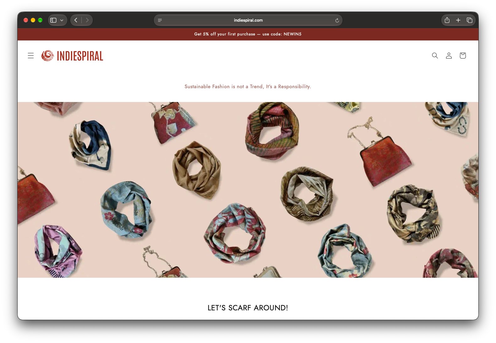 The Indiespiral homepage.
Indiespiral is a boutique textile brand creating handcrafted silk scarves using natural dyes and eco-printing techniques inspired by leaves and flowers. Alongside its retail collections, the business offers bespoke designs, custom-made scarves, shirts and saris, as well as corporate gifting.
The challenge was to bring this craft-led business online through a storefront that felt as considered as the products themselves, while making it easy for customers to discover collections, understand individual products and shop with confidence.
01The challenge: Making craftsmanship feel credible online
Handcrafted products have a story that goes beyond their appearance. Their materials, printing techniques, patterns and the care involved in making them contribute to their identity and value.
For a small business like Indiespiral, the website needed to communicate that value without relying on the physical experience of seeing or touching the products.
It also needed to do more than display a catalogue. The brand serves different needs, from individual customers looking for distinctive scarves to businesses exploring bespoke designs and corporate gifting.
The opportunity was to create a digital storefront that presented Indiespiral as a credible, distinctive brand while making its products and offerings easier to explore.
02My role: Turning a business into an online experience
I owned the website design, translating the client’s requirements into a cohesive e-commerce experience.
The project came through a connection in my cycling club. With the available budget, a fully custom-designed and developed website wasn’t practical. I chose Shopify as the foundation, using an existing theme and customising its visual design, typography, colours, layouts and content structure to suit the brand.
Rather than rebuilding standard e-commerce functionality from scratch, I focused on the experience customers would see and use: how the brand was introduced, how products were organised, how their details were presented and how customers could move towards a purchase.
The aim was to make the constraints work in the project’s favour, using an established platform while creating a storefront tailored to Indiespiral.
03The design approach
Creating a distinctive first impression
The homepage needed to establish the brand’s character immediately. I used generous product imagery, a restrained layout and a warm, earthy colour palette to complement the textiles rather than compete with them.
Editorial banners introduce the brand’s collections and bespoke services, while sections covering sustainability, craftsmanship and customer testimonials add context beyond the products themselves.
The result is a storefront that gives the products room to stand out while communicating a more complete brand identity.
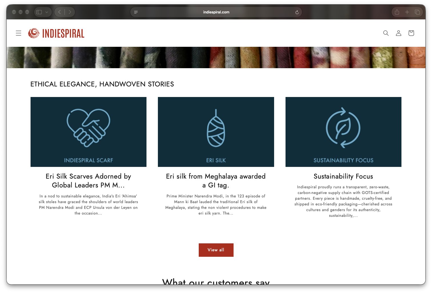 Sustainability and craftsmanship stories add context beyond the products.
Making product discovery intuitive
I structured the shopping experience around collections and categories, giving customers different ways to explore the range. Collection pages use prominent product photography, clear product names and pricing, with a spacious layout that keeps attention on the textiles.
This was particularly important for a catalogue where visual differences in colour, pattern and technique are central to the product’s appeal.
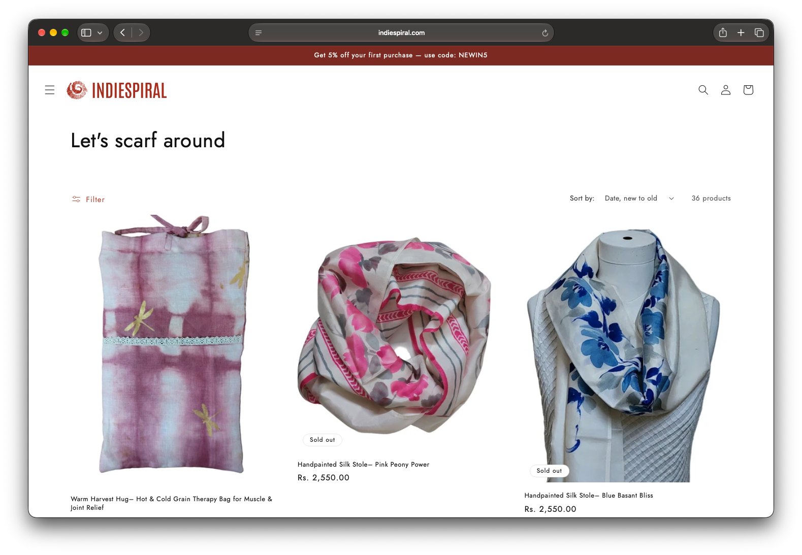 A collection page that keeps attention on the textiles.
Helping customers make informed purchases
The product detail page brings together the elements customers need to evaluate a handcrafted item online: multiple product images, pricing, descriptions, sizing, care instructions and clear purchasing actions.
The additional imagery gives customers a closer look at the scarves, while the written details explain their characteristics and how to care for them.
Together, these elements help bridge the gap between discovering a product visually and having enough information to consider purchasing it.
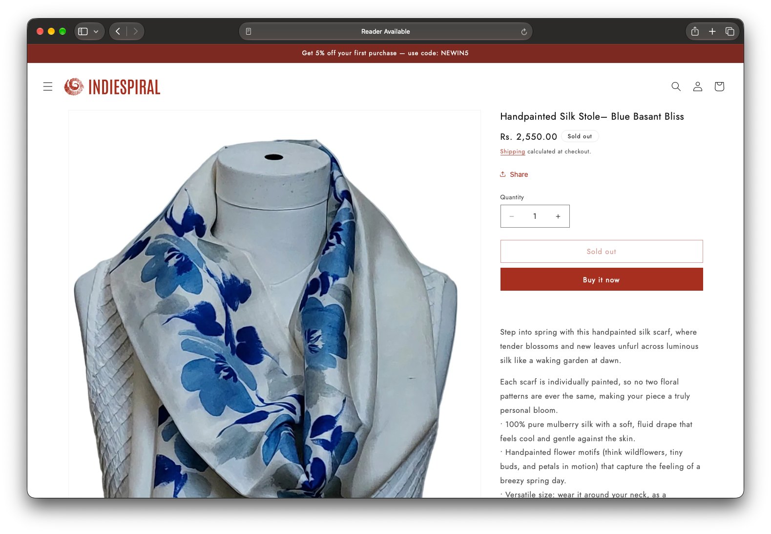 The product detail page.
Supporting more than one business need
Indiespiral isn’t limited to selling ready-made scarves. Its bespoke services and corporate gifting offering are also important parts of the business.
I incorporated these offerings into the broader storefront so visitors could discover the brand’s customisation capabilities alongside its retail collections. This allowed the website to represent the wider business, rather than functioning only as a product catalogue.
04Working within the constraints
The project required balancing design ambition with the cost and effort of implementation.
Shopify provided an established e-commerce foundation, allowing me to focus on customising the parts of the experience that most directly shaped the brand’s presentation and the shopping journey.
I adapted the theme’s visual language, page layouts and content hierarchy to create a more cohesive experience across the homepage, collection pages and product detail pages.
The decision wasn’t to avoid custom design altogether. It was to direct design effort towards the areas where it could make the most meaningful difference without the cost of building an entirely bespoke website.
05The outcome
The website launched on Shopify, bringing Indiespiral’s product collections, product information, bespoke offerings and brand story together in one online storefront.
It established a digital shopping experience through which customers could browse the available textiles, explore individual products and learn about the business’s wider offerings.
There are no verified performance metrics available to quantify the website’s commercial impact. The outcome I can confidently demonstrate is the completed storefront and the design decisions behind it.
What I took away
This project reinforced that good e-commerce design isn’t defined by how much is built from scratch.
For a small business, credibility comes from the coherence of the entire experience: how products are presented, how information is organised, how the brand communicates its value and how easily customers can navigate towards a purchase.
My role was to bring those elements together within the practical constraints of the project, creating an online experience that reflects the individuality of the products while serving the needs of the business.
Visit Indiespiral ↗
Duro Design Disruptors
Giving the people shaping a sustainable future a platform.
Outlook Business × Epistle2024
Digital platform for a video series and editorial initiative · Sustainability, architecture, design, and climate action
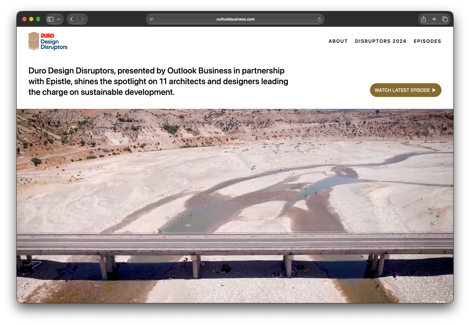 The homepage opens with environmental context.
01
The opportunity
Sustainable development is shaped by people working across disciplines, from architecture and engineering to ecological design and social impact. Yet their ideas and work often exist in separate conversations.
Duro Design Disruptors was created to bring these perspectives together through a collaborative video series and editorial initiative presented by Outlook Business in partnership with Epistle.
Hosted and led by Suneet Zishan Langar, the series spotlights people across India who are rethinking how we build, consume resources, and respond to environmental challenges.
The digital experience needed to bring this initiative together in one place, making it easy for audiences to understand the project’s purpose, discover the people involved, and explore the conversations through individual episodes.
02Designing for a multidisciplinary story
The challenge was to present a broad subject without making the experience feel fragmented.
The platform brings together several layers of content: the initiative’s mission, participating organisations and contributors, sustainability themes, and a growing library of video episodes.
Rather than treating these as disconnected sections, the experience organises them into a connected editorial journey. Visitors can first understand why the initiative matters, explore the people and organisations behind it, and then move into the conversations themselves.
The goal was to make a complex, multidisciplinary subject accessible through a clear and structured digital experience.
03Establishing context before content
The homepage introduces the initiative through its environmental context before moving into the people and conversations at its core.
A cinematic opening establishes the urgency of sustainability, followed by a concise introduction to the project’s purpose. A scrolling strip of themes, including biodiversity, decarbonisation, disaster resilience, and circularity, communicates the breadth of the conversation.
The experience then moves into the 2024 participants, connecting individuals and organisations with the issues they work on.
This sequence gives visitors context before asking them to explore individual episodes.
04Making the people behind the work discoverable
The initiative brings together architects, designers, engineers, and social impact leaders working across different areas of sustainability.
The participant section creates a structured overview of these contributors and their organisations. Consistent profile treatments help the audience scan the collection, while thematic labels provide context about each participant’s area of work.
The intent is to make the breadth of the initiative visible without losing the identity of the individuals and organisations involved.
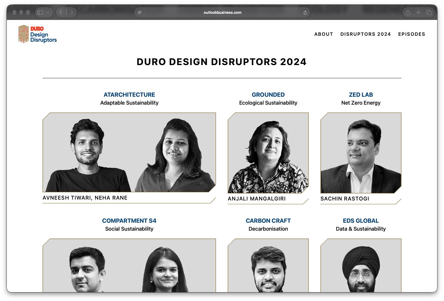 The 2024 participants, each labelled with their area of work.
05
Building an editorial system around video
The episodes are the core content of the platform. Each conversation explores a distinct challenge, from sustainable architecture and data-led design to affordable cooling, circularity, and decarbonisation.
The episode listing uses a consistent structure across titles, descriptions, episode identifiers, thematic categories, and video thumbnails. This gives each conversation its own entry point while maintaining a coherent system across the series.
Individual episode pages extend that structure into a dedicated viewing and reading experience. Video introduces the conversation, editorial copy establishes its context, and supporting photography and project descriptions expand on the ideas discussed.
The result is an experience designed to support both video consumption and deeper exploration of the work behind each conversation.
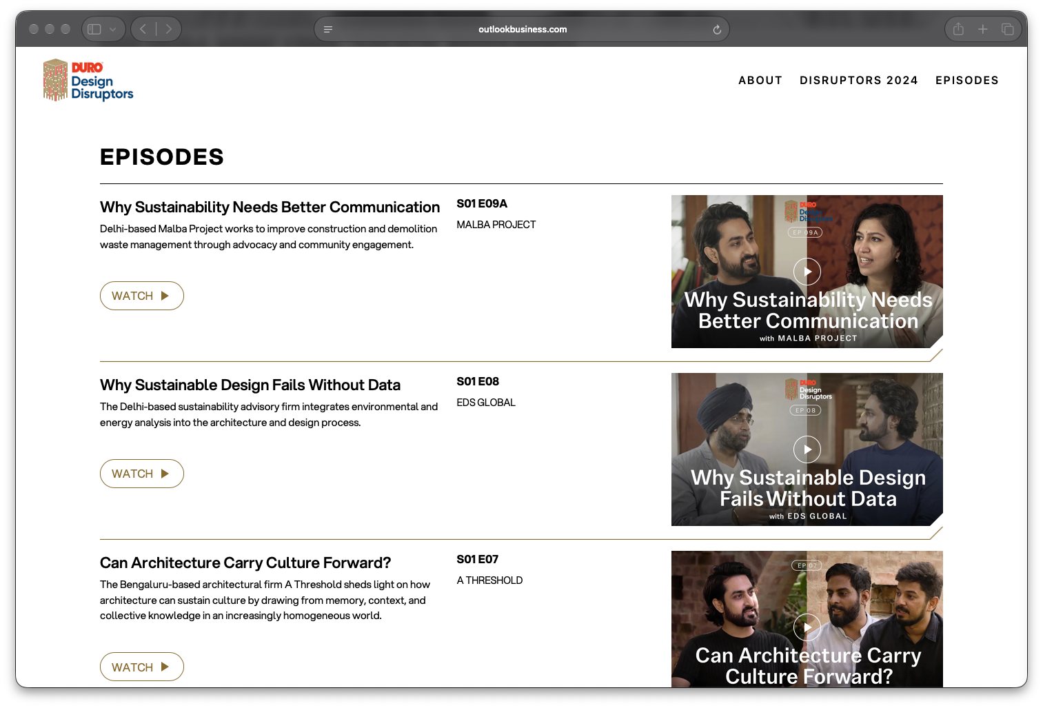 The episode listing: one consistent structure across the series.
06
Connecting the initiative to its partners
Outlook Business and Epistle are integral to the project’s positioning. The partner section gives both organisations a clear presence and provides context for their involvement.
This helps frame Duro Design Disruptors as a collaborative initiative rather than simply a collection of interviews. The wider platform connects the editorial purpose, the participating voices, and the organisations bringing the series to life.
05The outcome
The Duro Design Disruptors 2024 website brings the initiative’s purpose, participants, partners, and video episodes together in a single digital experience.
It establishes a consistent structure for presenting a multidisciplinary series, helping visitors move from understanding the initiative to discovering the people and ideas behind it.
Make a complex conversation about sustainability easier to navigate, explore, and engage with.
Visit Duro Design Disruptors ↗
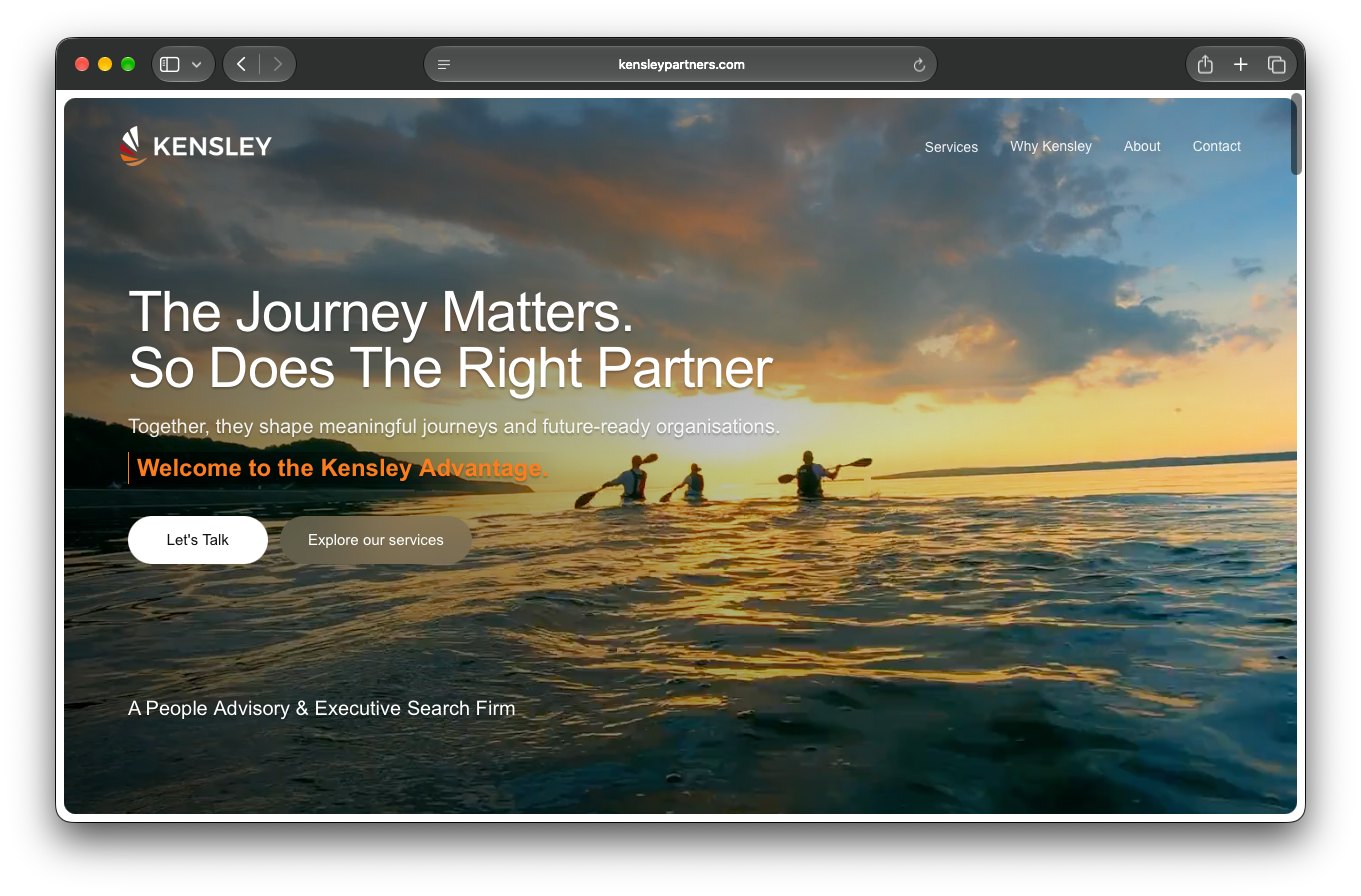 The homepage: warm landscape imagery and a direct invitation to talk.
The story behind the project
Sometimes, the best projects start with a conversation you weren’t expecting to have.
I was working from a coworking space when I overheard someone talking about looking for a designer. I decided to introduce myself, told him I was a designer working from the same space, and we got talking. That conversation turned into a freelance project to design the website for Kensley Partners, a boutique people advisory and leadership search firm.
It was a relatively new business, and the brief was an opportunity to shape how the company presented itself online from the beginning.
The challenge
People advisory is fundamentally about people, relationships and trust. Yet, websites in this space can easily feel corporate, formal and impersonal.
I wanted Kensley’s website to communicate the experience and credibility of the firm without feeling distant or intimidating. It needed to feel professional enough to speak to business leaders, but approachable enough to invite an honest conversation.
The challenge was to find that balance through the visual language, content structure and overall experience.
The approach
Rather than leaning on conventional corporate design, I explored a direction that felt warmer, more personal and less institutional.
01A warmer visual language
I used a restrained palette of deep navy, warm orange and soft neutrals. Large landscape imagery, natural lighting and sunset tones brought warmth into the experience, while the darker blue established a sense of confidence and professionalism.
02A more approachable experience
The website uses direct, conversational language throughout. Instead of presenting the firm’s services as a list of capabilities, the content frames them around the challenges organisations face and the support they need.
The aim was to make the firm feel like a partner people could speak to, rather than another consultancy selling a service.
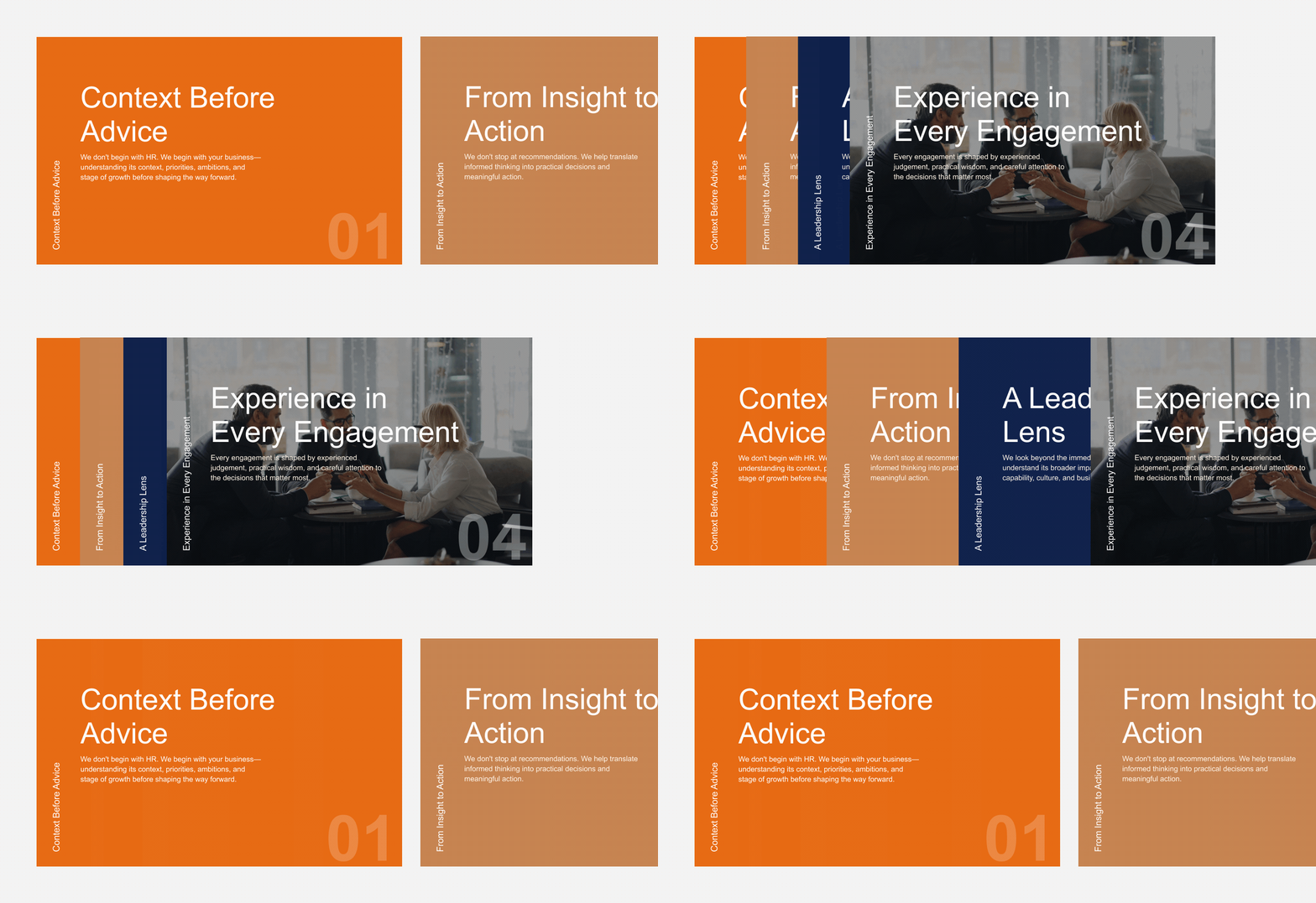 Services framed around the challenges organisations face, not a list of capabilities.
03
Structure that builds understanding
I organised the website around the questions a prospective client might have: Who is Kensley? What does the firm help with? Why should someone work with them? And how can they get in touch?
The homepage introduces the firm’s positioning before moving into its three service areas: People Advisory, Leadership Search and Strategic People Operations. Dedicated pages provide more context, while the About and Contact pages give visitors a way to understand the people behind the business and start a conversation.
Three service areas, one bento system: People Advisory, Leadership Search and Strategic People Operations.
04Making contact feel personal
The contact page was an opportunity to carry the same human tone into the final step. Rather than relying solely on a conventional enquiry form, I designed a guided, conversational form that asks visitors about themselves, their role, their organisation and their enquiry.
The interaction is intended to make reaching out feel more like the beginning of a conversation than filling out a corporate contact form.
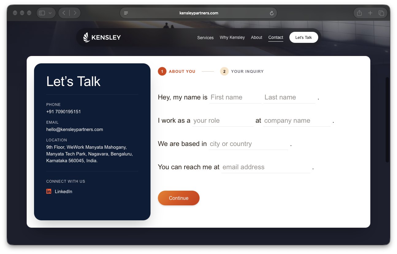 “Hey, my name is…” — a contact form that reads like the start of a conversation.
The result
The Kensley Partners website went live in 2026. The project gave the new firm a digital presence built around its positioning, services and approach to working with organisations.
With the website still relatively new, I don’t have performance data to evaluate its business impact. For me, the work was about translating the character of a people-focused business into a website that feels credible, clear and approachable.
A small project that started with a conversation
This project was a reminder that freelance opportunities don’t always begin with a formal brief or a planned introduction. Sometimes, they begin by putting yourself out there.
And in this case, that first conversation led to designing a digital experience for a business whose work is, at its core, about building better working relationships.
Visit Kensley Partners ↗
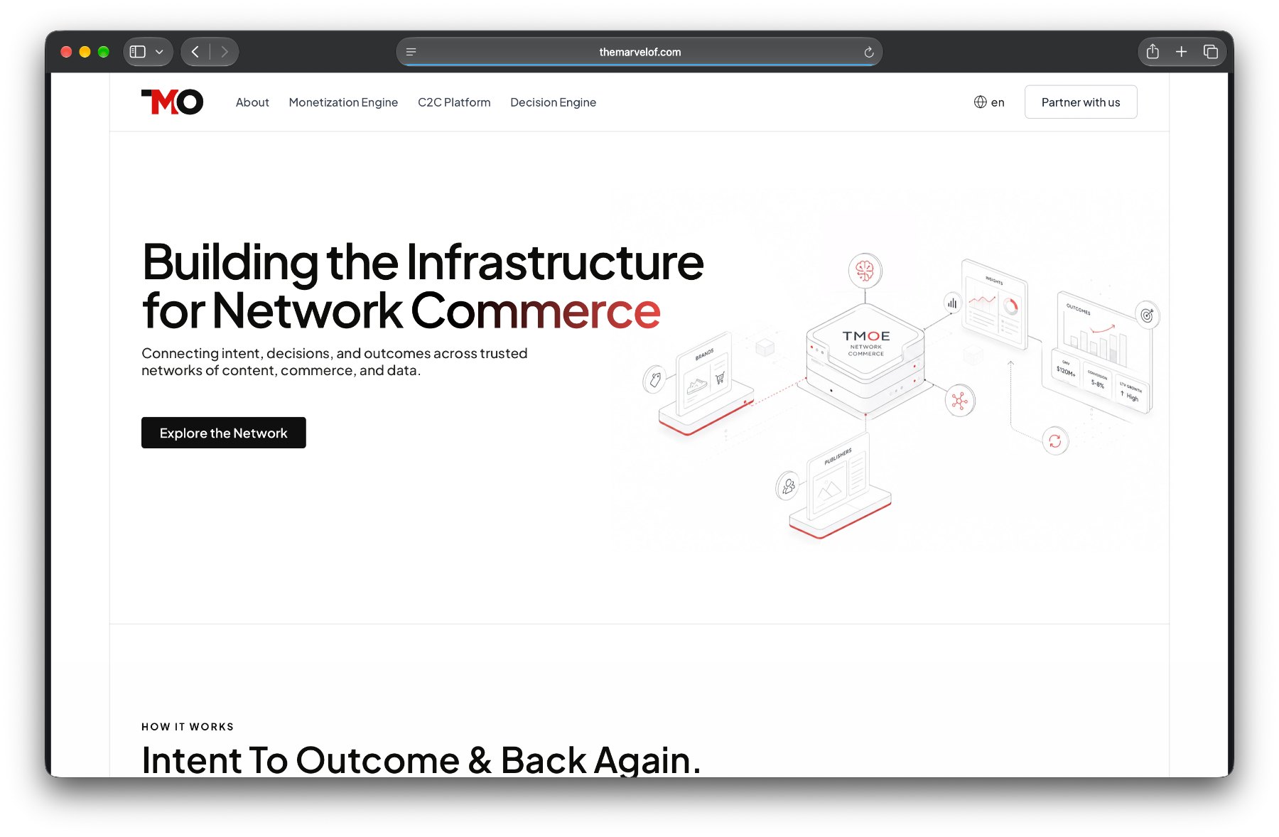 One idea up front: building the infrastructure for network commerce.
A business with three offerings needed one story.
When I moved to TMOE (The Marvel of Everything), one of my first projects was redesigning its corporate website. The business was evolving, with three distinct offerings spanning content commerce, consumer decision intelligence, and technology partnerships. The challenge was to bring them together under one coherent brand without losing what made each offering different.
The existing website communicated what TMOE did, but the different offerings felt disconnected. I wanted to create a clearer narrative, one that helped visitors understand not just the individual products, but how they fit into a larger network commerce ecosystem.
01Bringing the pieces together
I started by rethinking how the business was presented. The new website introduced TMOE through a single idea: building the infrastructure for network commerce. From there, the content guided visitors through how the business worked, the outcomes it delivered, and the three offerings that made up the ecosystem.
Rather than treating each offering as a standalone product, I designed the experience to show how they connected. This gave the website a more unified story and made the relationship between the different parts of the business easier to understand.
02Turning brand colours into a visual system
I brought TMOE’s brand colours into the redesign and explored gradients as a way to give the identity more depth and flexibility. Each offering received its own visual treatment, while the shared colour language kept everything connected.
The gradients weren’t intended to live only on the website. I wanted them to become a reusable visual asset that could extend into presentations, social media templates and other brand communications. This helped establish a more consistent visual language across different touchpoints.
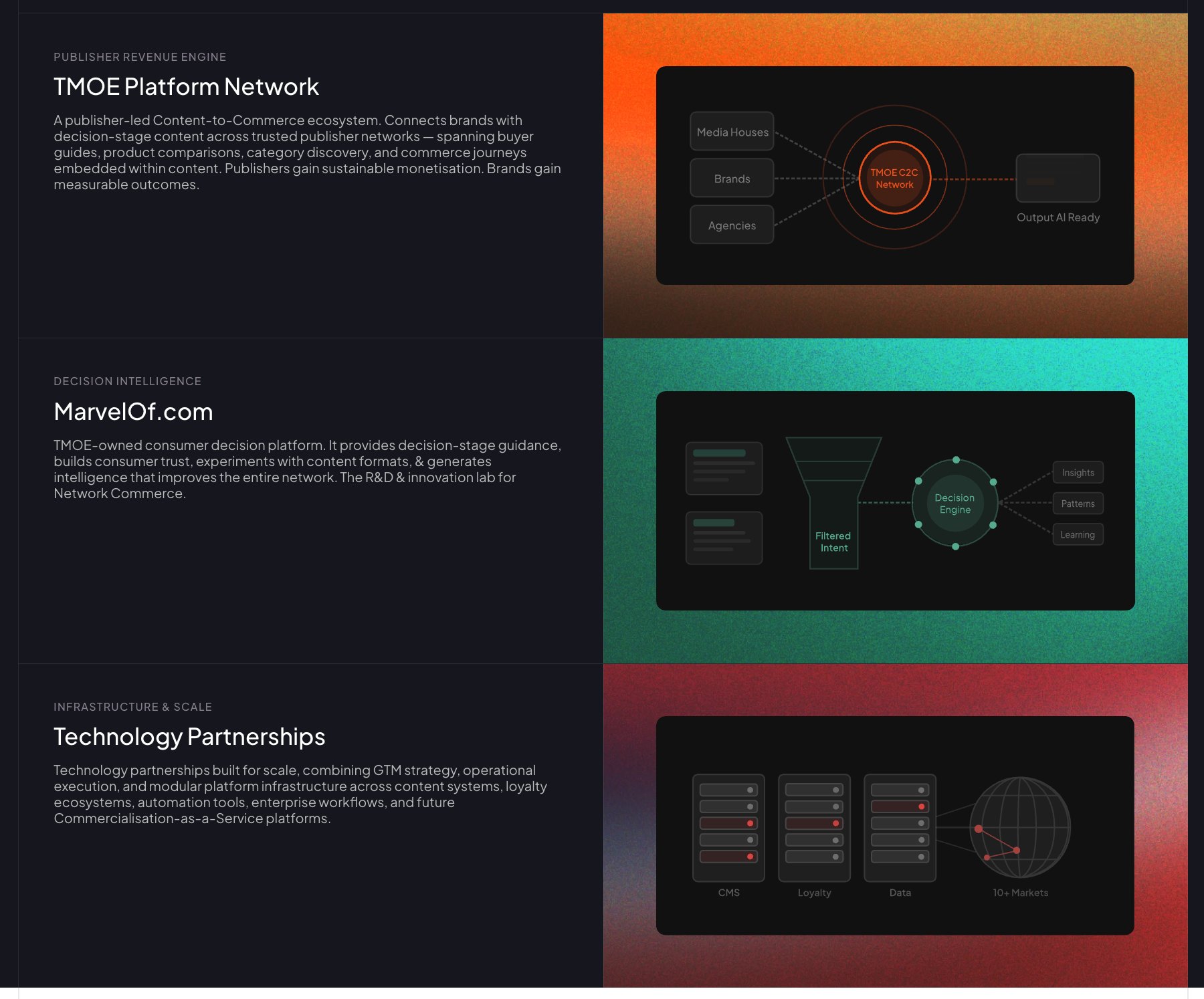 Three offerings, three gradients, one colour language.
03
Making complex ideas easier to understand
Network commerce isn’t the easiest concept to communicate at a glance. Instead of relying entirely on paragraphs of copy, I used structured layouts, diagrams, and visual illustrations to explain how the different offerings worked.
I also introduced animations throughout the website to add movement and make the experience feel more engaging. These interactions helped bring the digital experience to life without making the interface feel unnecessarily complicated.
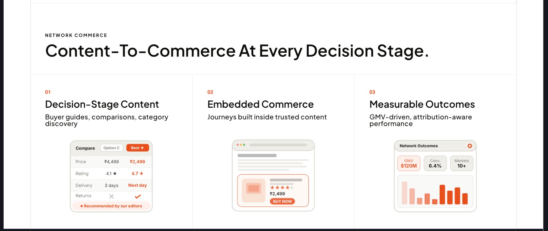 Illustrations doing the explaining: decision-stage content, embedded commerce, measurable outcomes.
More than a website refresh
The redesign gave TMOE a more cohesive way to present its business, connect its three offerings, and express its brand visually. It also established a visual direction that could be carried beyond the website into other company communications.
For me, the project was about more than updating the interface. It was about finding a way to make a complex business feel like one connected story, both in how it was explained and in how it looked.
Visit TMOE ↗
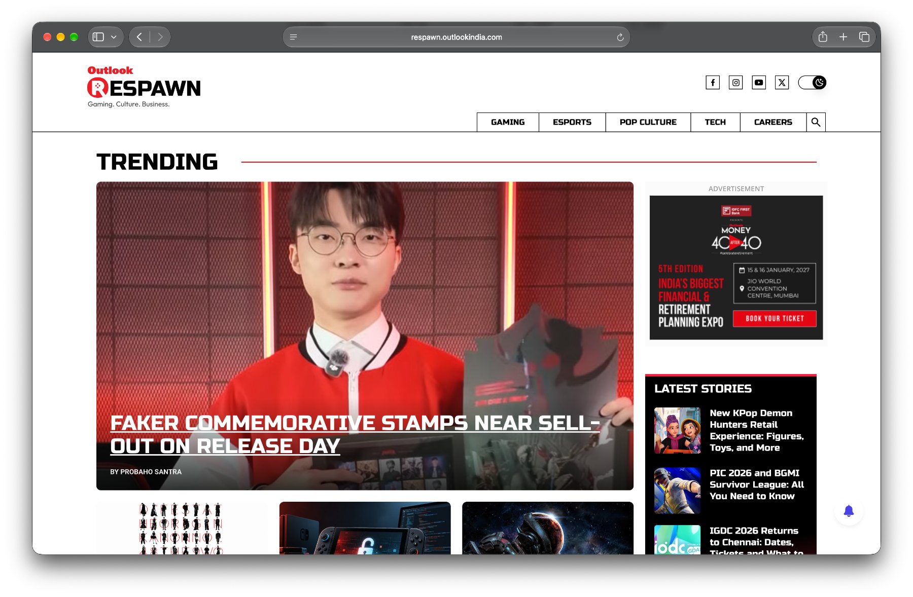 The Respawn homepage: bold type, red accents, trending up front.
A new digital destination for gaming enthusiasts.
Outlook Respawn was a new vertical within the Outlook ecosystem, created to serve India’s growing gaming audience. The platform brought together gaming, esports, pop culture, technology, and careers, giving enthusiasts a place to keep up with the stories, people, and developments shaping the industry.
The challenge was to give this new vertical a distinct identity while making a wide range of content easy to discover, navigate, and read.
01From content to discovery
Gaming audiences follow more than just games. They follow tournaments, creators, industry developments, new technology, and the culture that grows around them. The homepage needed to accommodate all these interests without feeling like an endless stream of headlines.
I designed the homepage around clearly defined content categories, each with its own section and story layouts. Trending stories received prominence, while supporting cards helped readers explore more topics at a glance. Dedicated sections for Gaming, Esports, Pop Culture, Tech, and Careers gave the content a predictable structure without making every section feel identical.
The result was a homepage designed for both quick scanning and deeper exploration.
02An identity of its own
As a new vertical, Respawn needed to feel distinct within the Outlook family. I worked with a bold visual direction, strong typography, compact headlines, and red accents to give the platform an energetic character suited to gaming culture.
The layouts balanced prominent imagery with dense editorial content. Story cards varied in size and arrangement to establish hierarchy, while consistent section headings, metadata, and navigation helped tie the experience together.
03Designed for the full reading journey
The homepage was only the beginning. Once readers found a story, the article experience needed to carry them through it.
I designed the article template with a clear headline and metadata hierarchy, followed by structured content, highlights where relevant, and supporting visual elements. Trending stories remained accessible alongside the article, while related articles offered a path to continue exploring.
The intention was to make the experience work at two speeds: readers could quickly catch up on what was happening in gaming, or settle into a longer story when something caught their attention.
A foundation for a growing vertical
Outlook Respawn brought together several sides of gaming culture under one digital experience. My focus was on creating a recognisable identity, establishing a flexible content hierarchy, and connecting discovery with reading in a way that could support the vertical as its coverage expanded.
Rather than treating every story as an isolated piece of content, the design gave readers multiple ways to find their next one.
Visit Outlook Respawn ↗
VOLK
Building an energy drink brand’s digital home in a day.
A launch-ready website for an emerging energy drink brand
- Role
- UI/UX design
- Scope
- Website design, visual direction, page structure, product storytelling, and AI-generated product imagery
- Timeline
- 1 day, 2026
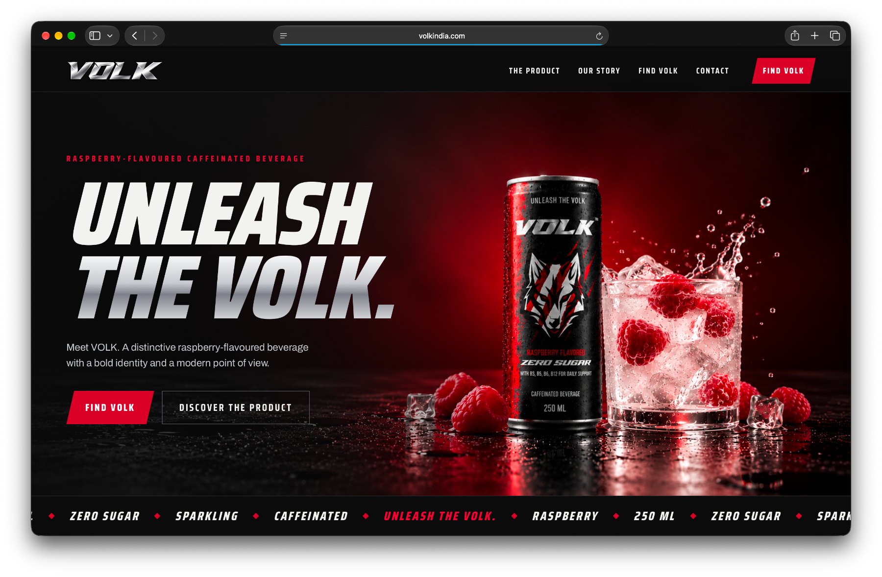 “Unleash the Volk.” — black, white and electric red, with the can at centre stage.
The brief: They needed to be live yesterday.
VOLK came to me through a very close friend whose brother was launching an energy drink brand. They needed a website, and they needed it urgently. The launch couldn’t wait around for a lengthy design process.
I had roughly a day to put the experience together.
The challenge wasn’t just to create a website that looked good. It needed to give a new product a strong digital presence, communicate what made the drink different, and create a brand experience that felt considered despite the tight timeline.
There wasn’t much room for an elaborate process. I had to focus on the decisions that would make the biggest difference.
01Giving VOLK a world of its own
I approached the website as an extension of the product’s personality.
VOLK had a bold identity built around black, white, and electric red. Rather than treating the website as a conventional product page, I wanted it to feel closer to a high-energy campaign: strong typography, dramatic product visuals, sharp contrasts, and a clear visual rhythm.
The oversized headlines and condensed type gave the brand an assertive voice. Red became the accent that pulled attention towards important messages and calls to action, while dark backgrounds allowed the can and its packaging to take centre stage.
The intention was to make the website feel like VOLK had an identity beyond the product itself.
02Making the product the hero
For an energy drink, the packaging does a lot of the talking. But a can photographed against a plain background wouldn’t be enough to build the experience I had in mind.
I used AI-generated product photography to create a range of visual scenarios around the same product: dramatic splashes, condensation, raspberries, close-up product shots, and people interacting with the can.
These visuals helped establish a consistent world for VOLK across the website, from the opening hero to the product details and social gallery.
Working with AI imagery also meant I had to pay attention to product consistency. The can needed to remain recognisable across different scenes, with its packaging and branding intact. That became an important constraint when generating visuals for the website.
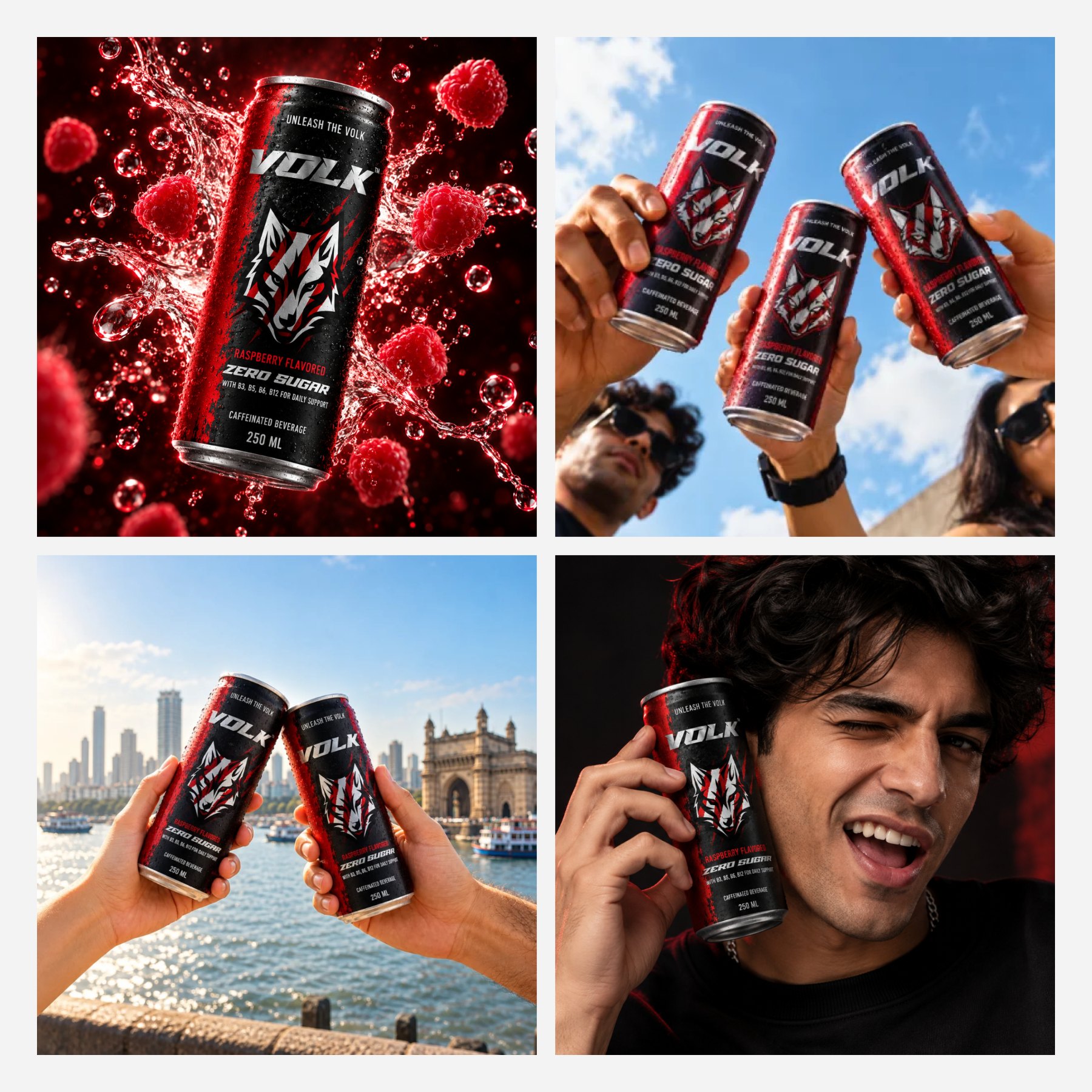 AI-generated scenes, one recognisable can.
03
Turning a product into a story
I structured the page to move from attention to information, rather than presenting everything at once.
The opening section establishes the brand and its product. From there, the experience introduces the drink’s key attributes, including its raspberry flavour, caffeine content, zero-sugar positioning, and vitamin blend.
A dedicated flavour section gives the product more visual presence, while the expandable product details organise information such as nutrition, ingredients, and manufacturer details without overwhelming the page.
I also included a brand story section to communicate VOLK’s point of view, followed by a social gallery and dedicated contact and discovery sections.
Each section had a role: build interest, explain the product, establish the brand, or give visitors a next step.
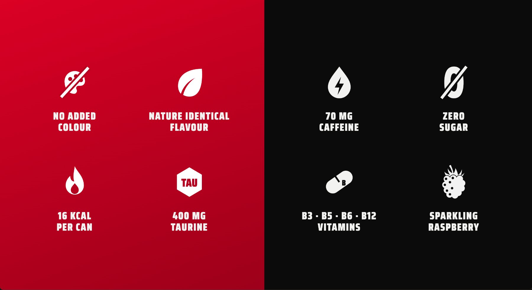 Product attributes at a glance: caffeine, zero sugar, vitamins, flavour.
04
Designed for the deadline, not an ideal timeline
With the launch approaching, I had to prioritise getting the complete experience into place over exploring multiple design directions.
That meant making decisions quickly about the visual system, page structure, content hierarchy, and imagery. Instead of treating every section as a separate design exercise, I built the experience around a consistent set of visual rules that could carry through the entire page.
AI-generated imagery helped me develop the visual storytelling without relying entirely on a traditional product photoshoot.
The result was a complete website concept developed in approximately one day, ready to support the brand’s launch.
What this project taught me
VOLK was a reminder that good design doesn’t always happen under ideal conditions.
Sometimes the job is to work with what is available, understand what matters most, and make enough strong decisions to bring an idea to life without losing its character.
In this project, the challenge was balancing speed with consistency: creating a distinctive brand experience, communicating product information clearly, and using generated imagery to build a cohesive visual world.
It was a small project with a short timeline, but it gave me the opportunity to work across the website experience, art direction, and product storytelling in a single, focused sprint.
Visit VOLK ↗
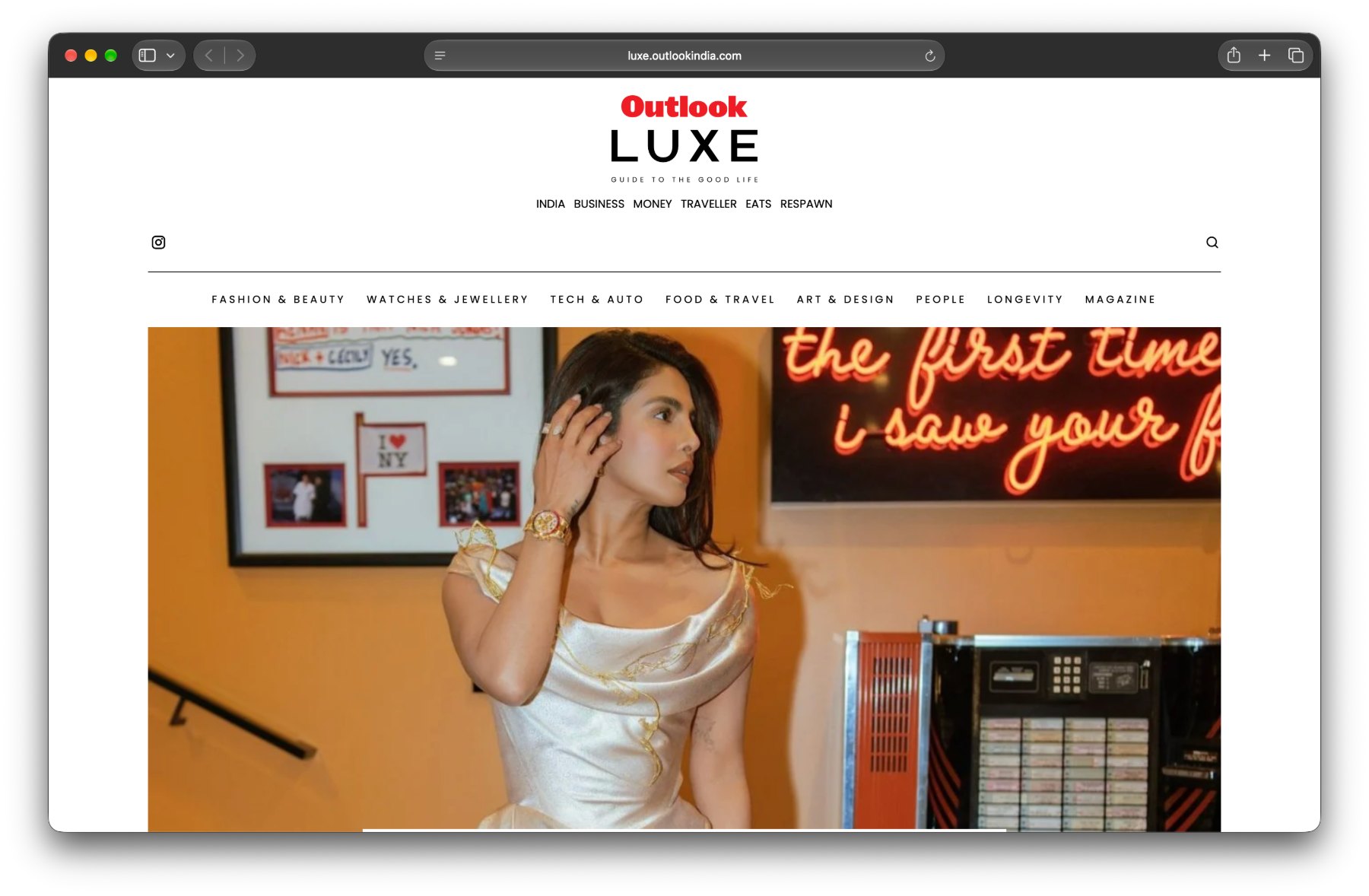 luxe.outlookindia.com: the masthead, category navigation and a full-width hero.
01
A new space for luxury
Outlook had an opportunity to expand into a new audience with Outlook Luxe, a vertical focused on luxury, fashion, travel, watches, automobiles, beauty, and fine dining.
The challenge was to create a digital experience that felt right for this audience while fitting into the wider Outlook ecosystem. The content needed to cover a range of luxury interests without making the website feel cluttered or difficult to explore.
02Designing the experience
I worked on the website’s structure and visual design, thinking about how readers would discover stories across different categories. The homepage needed to balance prominent editorial features with smaller stories, giving important content room to stand out while keeping other discoveries within easy reach.
I explored different content layouts, image treatments, typography, and hierarchy to give the website a distinct identity. From the cover-story feature to category sections and article listings, each part needed to feel connected while serving a different editorial purpose.
The article experience was equally important. I designed layouts that made long-form content comfortable to read, supported by imagery, related stories, and a clear content hierarchy.
03From digital to print
As Outlook Luxe evolved, the team also launched a magazine. This extended the brand beyond the website and introduced a new format for presenting its luxury and lifestyle stories.
It was exciting to see the vertical grow from a digital experience into a broader editorial offering.
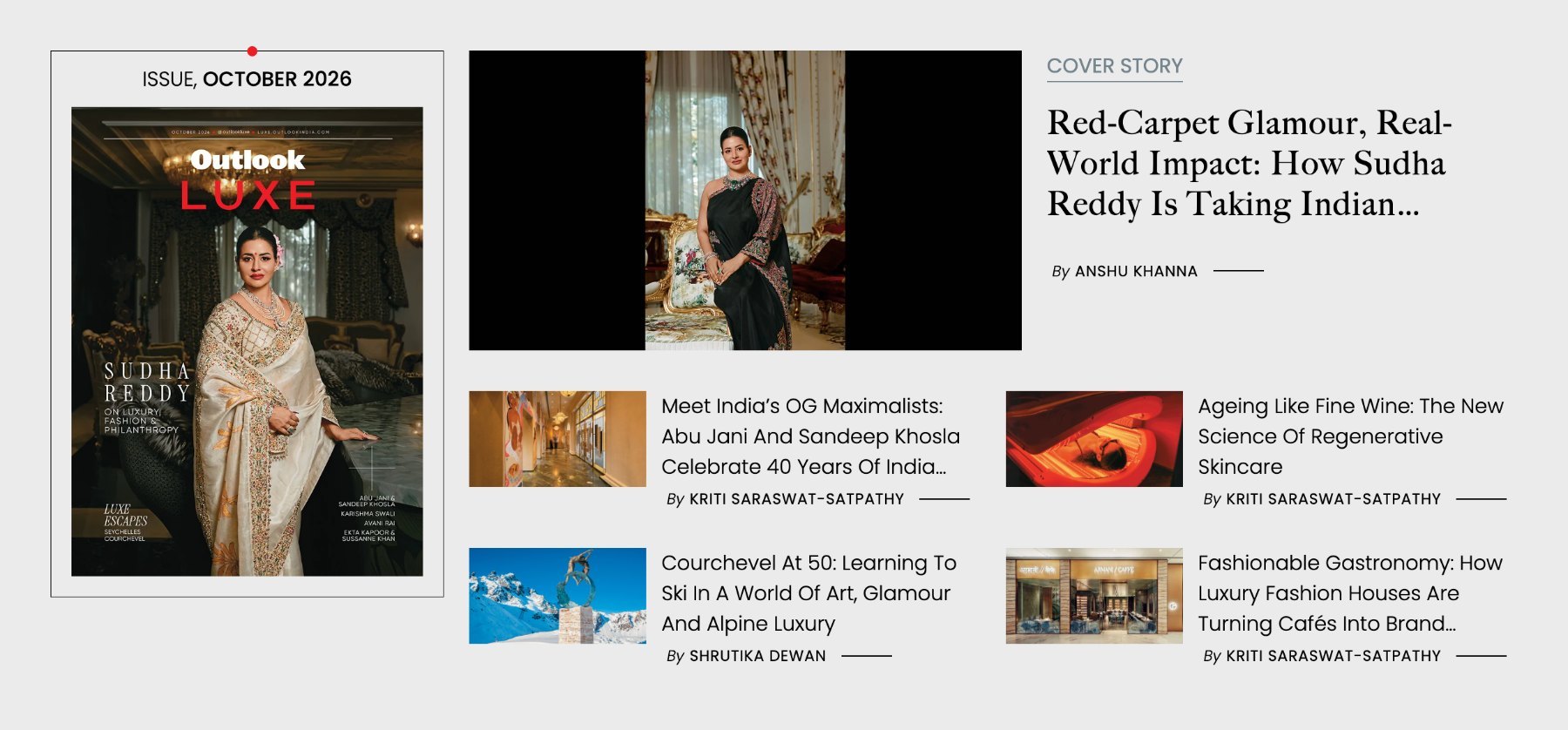 The current issue sits beside the cover story, with smaller features in a two-column grid.
What I took away
Outlook Luxe was an opportunity to design for a content category where visual presentation plays a major role in how people engage with stories. It reinforced how much the right balance of imagery, typography, spacing, and content hierarchy can shape a digital experience.
The project was also a reminder that a website is not just a collection of pages. It is a system that needs to accommodate different kinds of content while maintaining a consistent identity.
Visit Outlook Luxe ↗